Foundations

Foundations are the visual and structural elements of our design system. Foundations were created as the building blocks of all user interface elements.

Foundations in our design system create engaging end-to-end user experiences. This includes guidance on color, typography, iconography, layout and structure.

Foundation Preview
Color
Color in the shdSys is a strategic tool, harmonizing aesthetics and functionality. Our meticulously curated color palette reflects brand identity, while adhering to accessibility standards. With a focus on balance, contrast, and meaningful color choices, the shdSys ensures a visually pleasing and inclusive digital environment that enhances user engagement and brand cohesion.
Typography
In the SHD Design System, typography is meticulously curated to embody a harmonious blend of style and readability. With a carefully selected font palette, varying weights, and precise spacing, our typography guidelines aim to establish a visual hierarchy, ensuring a polished and accessible presentation across all digital interfaces.
Logos
The brand logo for the shdsys embodies a fusion of simplicity and uniqueness. Crafted with precision, it symbolizes the essence of Shakhawat Hossain's design philosophy, showcasing a distinctive visual identity that resonates with clarity and sophistication. Through its thoughtful design, the SHD logo serves as a memorable representation of the design system's commitment to excellence and innovation.
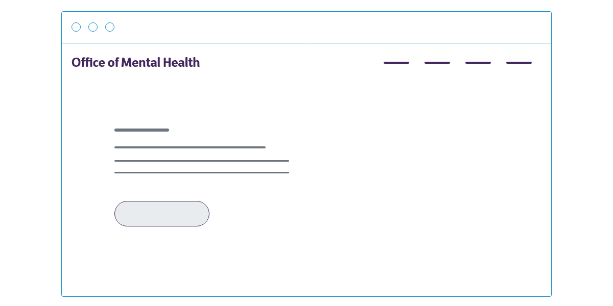
Responsive Design
Responsive design is at the core of the SHD Design System website, ensuring a seamless and consistent user experience across devices of all sizes. Our guidelines prioritize flexible layouts, fluid grids, and media queries to adapt gracefully to varying screen dimensions. By embracing responsive design principles, we guarantee accessibility and usability for all users, reinforcing the SHD Design System's commitment to delivering a top-notch digital experience.
Page Setup
Page setup in the shdSys website is thoughtfully designed for optimal user navigation and engagement. Our layout principles prioritize clarity, consistency, and responsive design, ensuring a seamless experience across various devices. With carefully structured grids, intuitive navigation, and strategic placement of elements, the page setup enhances usability, readability, and overall user satisfaction within the SHD Design System ecosystem.
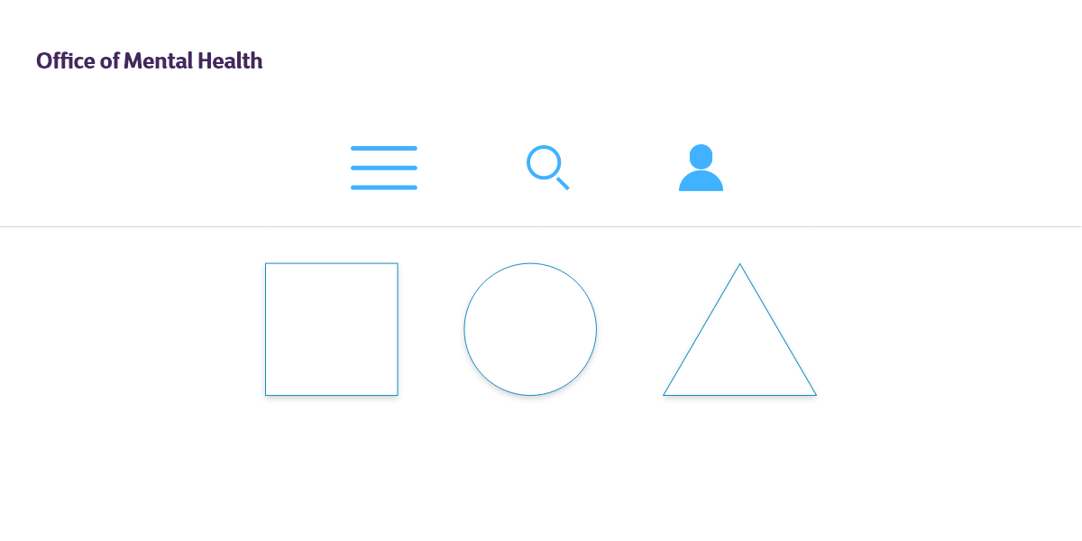
Icons
Icons within the SHD Design System website are meticulously crafted visual elements that seamlessly integrate into the user interface. Designed for clarity and consistency, our iconography follows a unified style guide, enhancing usability and aiding in intuitive navigation. Each icon in the SHD Design System serves as a visual cue, contributing to a cohesive and delightful user experience across the digital platform.
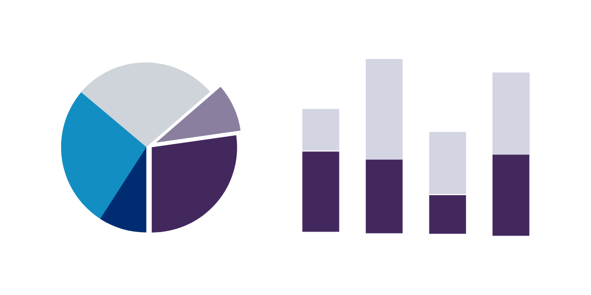
Data Visualization
Data visualization in the SHD Design System website transforms complex information into visually engaging and comprehensible graphics. Following a systematic approach, our design principles ensure clarity, accessibility, and aesthetic appeal in presenting data. Through thoughtful visualization techniques, the SHD Design System empowers users to interpret information effortlessly, fostering an enriched and informed digital experience.
©2022. All rights reserved.
Privacy Policy
Terms of Use